
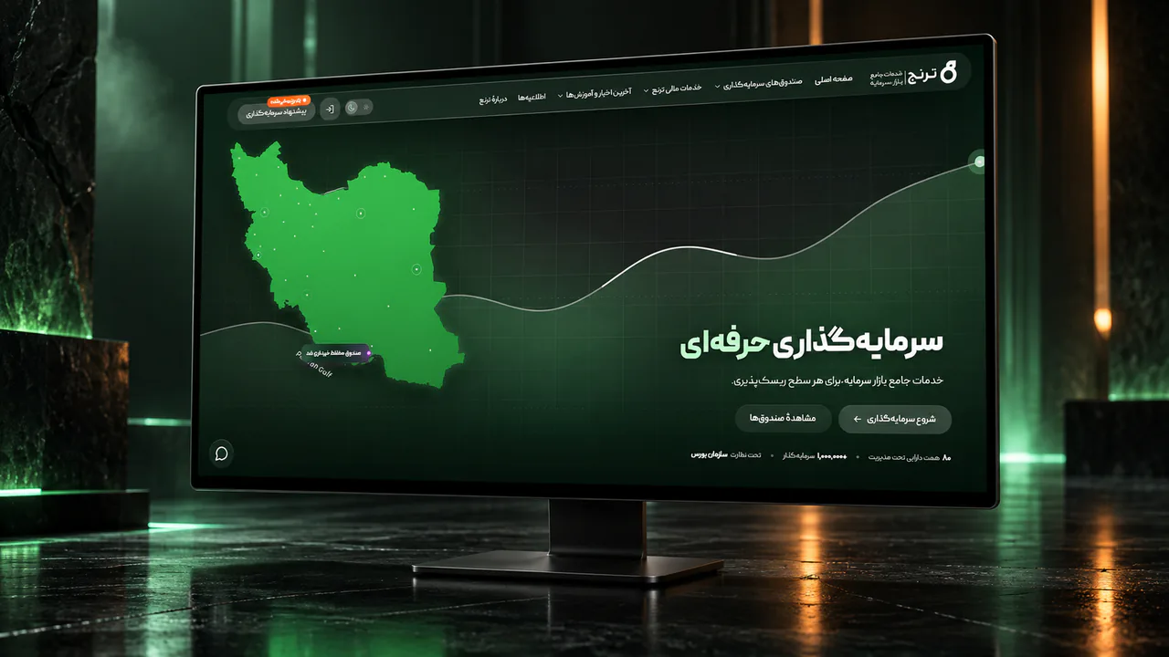
Toranj Capital Website Redesign
01Context / challenge
A broad set of services was hard to scan
- 01Investment products
- 02Portfolio management
- 03Institutional services
- 04Risk assessment
From site structure to working prototype
My responsibilities:
- Information architecture
- User flows
- UX design
- UI design
- Design system
- Responsive design
- Prototyping
- Risk Assessment UX redesign
- Risk Assessment logic redesign
What changed in the redesign
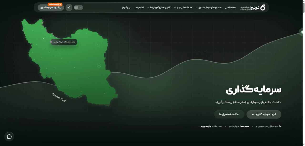
Homepage
Previous website
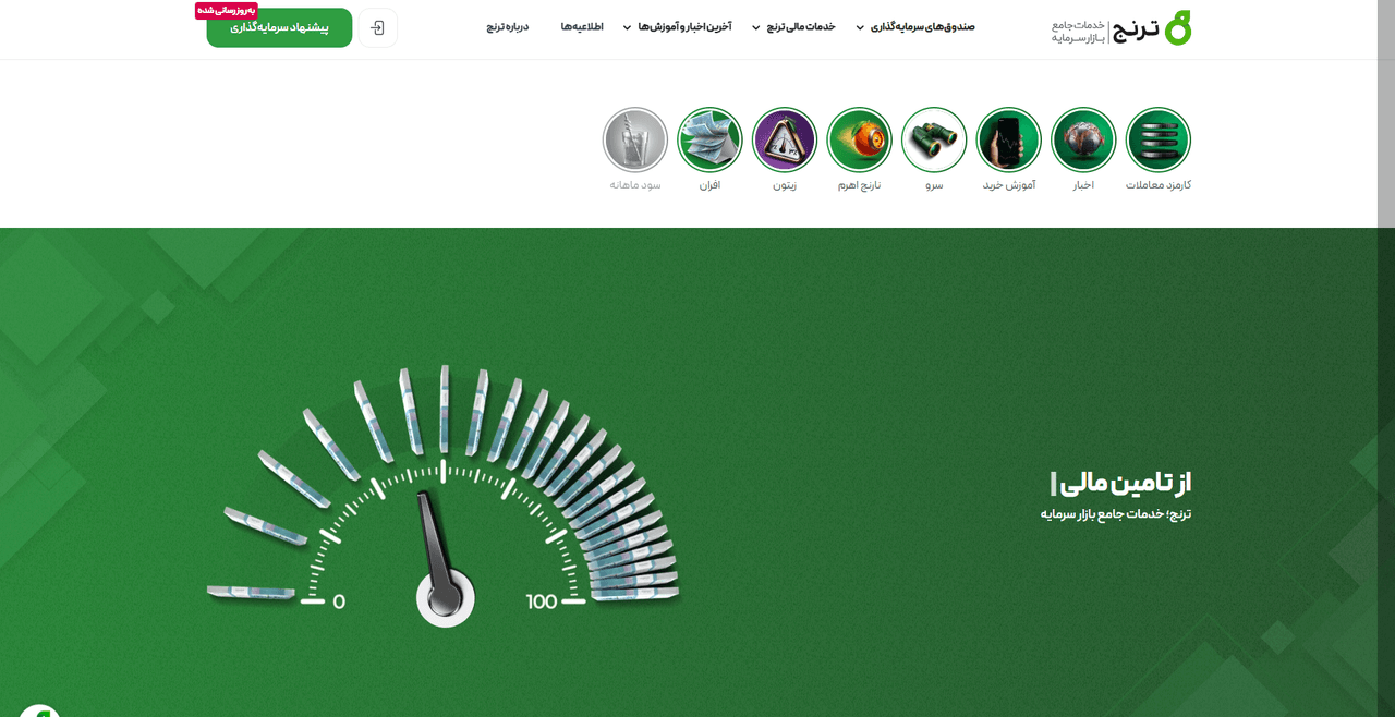
Redesign
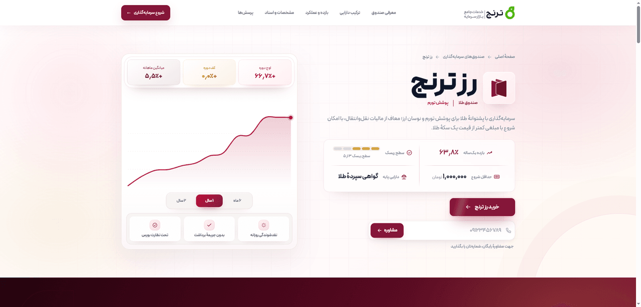
Investment product
Previous website
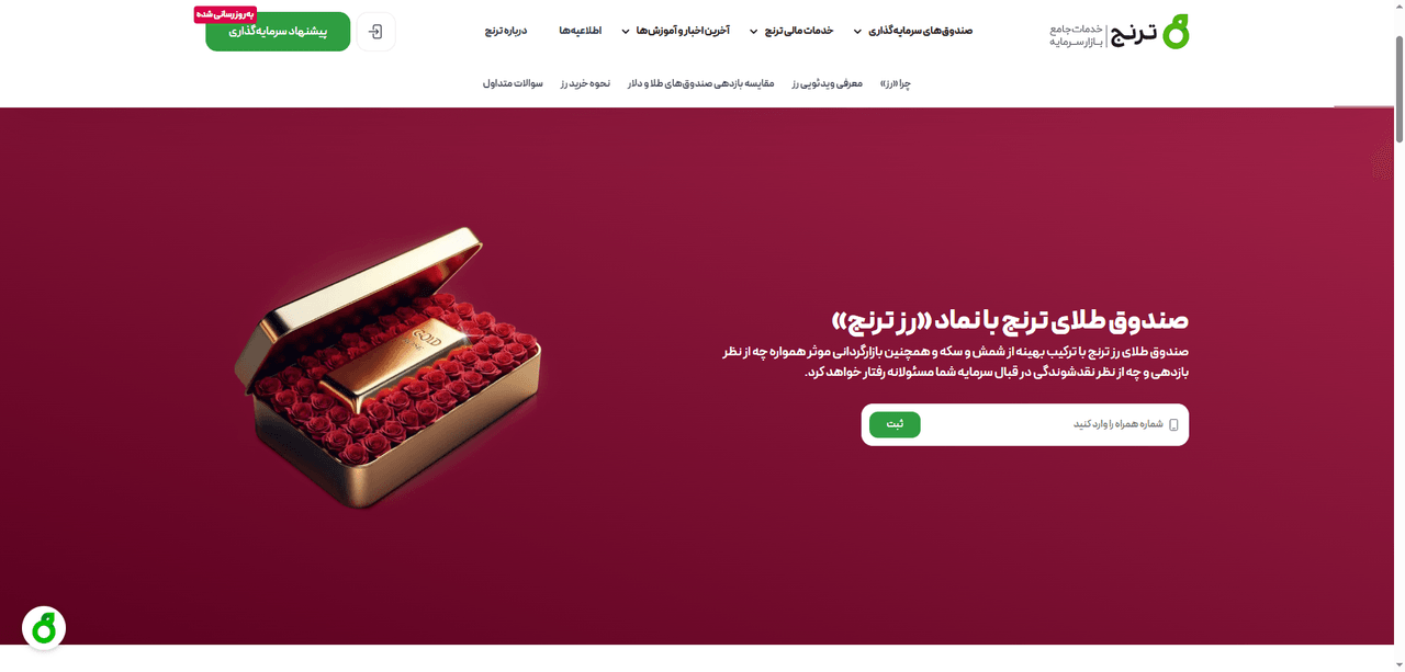
Redesign
Risk Assessment
Previous website
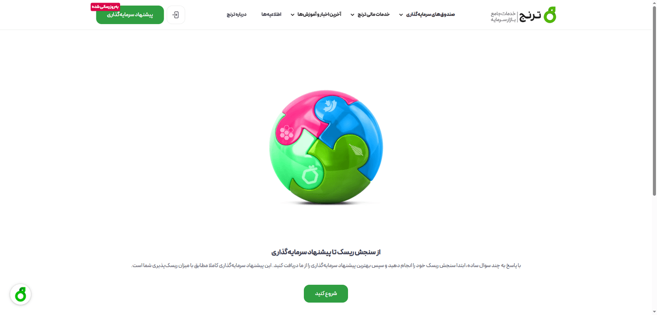
Redesign
Organized around what people need
- Proposition and trust
- Services by audience
- Investment guidance
- Fund discovery
- Company context
- News / contact
- Fund discovery and comparison
- Product template
- Key facts and actions
- Risk and underlying assets
- Performance
- Education
- Allocation and suitability
- Comparison and calculator
- Documents and FAQs
- Purchase / consultation
- Bespoke portfolio management
- Market making
- Corporate financing
- Venture capital
- Assessment questions
- Scoring logic
- Recommendation
- About and method
- Team
- Credentials
- Careers
- Editorial content
- Regulatory notices
- Contact access
Start with the client’s goal
Clients choose their goal first, review a suggested portfolio type, complete risk assessment and then request a consultation.
Choose objective
Review portfolio archetype
Complete Risk Assessment
Request consultation
A step-by-step risk assessment
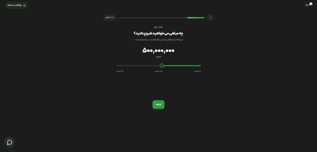
The assessment guides people from the required information to a relevant recommendation in five focused steps.
Recommendation path
Inputs
Assessment dimensions
Risk profile
Recommendation
Interface evidence
- Focused header with return-to-site action
- Five-step progress indicator
- Investment-amount input
- Choice-based questions
- Behavioral loss and liquidity-stress scenarios
- Forward and back navigation
Define the structure before the visual design
Selected journeyRetail investment
Homepage discovery
Product anatomy
Portfolio selector
Institutional template
Risk Assessment
Responsive reflow
Key UX decisions
Organize around intent
Investment products and financial services form the primary architecture.
Differentiate by audience
Retail, portfolio, issuer, business, and startup paths do not share one generic funnel.
Progressive product hierarchy
Decision-critical information leads; education and documentation follow.
Goal-led portfolio selection
Objectives connect users to relevant portfolio archetypes.
Guided financing pathfinder
Businesses move toward a relevant financing method before the lead form.
Focused assessment shell
Sequential assessment content is separated from the broader marketing shell.
Task-specific actions
Buy, consult, request, explore, and begin assessment match the user’s task.
Layer trust evidence
Documents, licences, process explanations, external sources, and contact access support confidence.
Key screens from the final design
Keep the same priorities on desktop and mobile
On mobile, important content moves up, side columns become stacked sections and the main action stays easy to reach.
One interface system across the website
Typography, colours and common components stay consistent, while each product keeps its own accent colour.
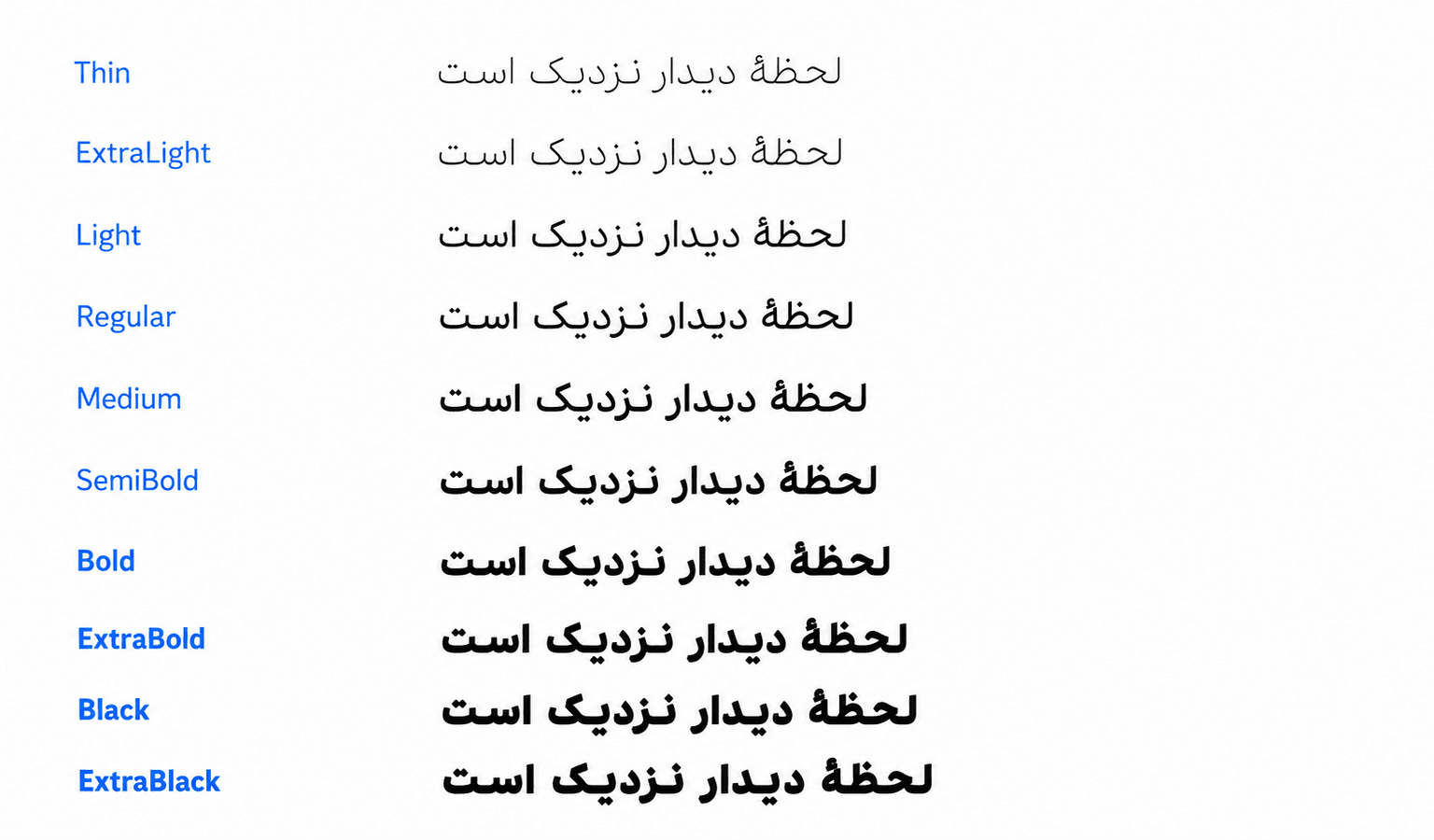
Peyda weights support a clear and readable hierarchy across Persian interfaces.
- PrimaryActions and emphasis
#5FC970 - SecondarySupporting information
#5C93D4 - Dark backgroundPrimary dark surface
#1C1C1C - Light textText on dark surfaces
#E2E8F0
What was checked, and what still needs testing
Existing strengths
- One H1 on each of nine audited redesign routes
- No missing alt text among counted images
- :focus-visible rules
- prefers-reduced-motion support
- No horizontal overflow in the audited phone homepage
- Semantic theme and status tokens
Remaining validation needs
- Controls below the recommended 44×44px target
- Unnamed controls on Home, Product, and Risk
- Phone links with only 26px visible height
- Broken assets on Home, Product, and Risk
- Weak tablet reflow
- Small Risk input and navigation targets
- Form-error and recovery behavior not documented
- Screen-reader, keyboard, contrast, zoom, reflow, and error-state testing
The structure is ready; validation is not finished
The redesign now gives retail investing, portfolio management, business services and risk assessment a clear place in the website.
The available evidence shows the design work and system consistency. Usability, accessibility and business impact still need to be tested after launch.
What I would improve today
Replace the phone-only tablet state with a fluid intermediate grid.
Reduce dependence on separate desktop and mobile homepage documents.
Formalize responsive rules for charts, tables, and financial metrics.
Confirm sticky-action behavior at small heights and zoomed layouts.
Test navigation, forms, and Risk Assessment across keyboard, touch, and orientation changes.
Resolve broken assets and control labelling before final captures.
Waiting to launch
There are no verified product or business metrics yet.
The delivered work includes the website structure, page templates, responsive layouts, shared components and the redesigned risk assessment.
What I learned from the project
Organize a broad financial institution around audience intent, not internal structure.
Related services can share a system without sharing the same conversion model.
Progressive disclosure can preserve readability without hiding decision-critical facts.
Responsive design needs a deliberate intermediate state—not only desktop and phone.
Transparent evidence boundaries make an awaiting-launch case study more credible.